Banco Sabadell México
Visit Website
Company
Banco Sabadell Mexico
Year
2017
Role
Lead UX Designer
Team
Iban Curdu (UI Lead)
Evelia Molina, Tomeu Cot, Xavier Martinez (Front-End Team)
Problem Statement
Design and develope a new brand website for Bank Sabadell in México. Bank Sabadell a leading bank in Spain wasn't able to reach their customers with the current website, the challenge was to develope a site that apeared in the results in google.
The main aim of this project was to re-design the website for Banco Sabadell in Mexico. This was due to a variety of reasons, the main ones being that the page was not responsive, the positioning within search listings needed to be improved and the website was not up-to-date with the new trends seen in banking websites.
Process
We started with a competitive analysis in which we studied banks within Mexico, including online-only banks. We then identified where Banco Sabadell should be positioned, which was towards the centre given that it is a more traditional bank. Following this, we created the sitemap structure and looked at how to organise the current content. Finally, we created wireframes which were to be tested by users in Mexico. We created the final designs using the results from these user tests.
Modules Structure
After organising the content, we created the architecture of the page in a modules structure which allowed us to use content in different parts of the website. In this way, we could also see which module fulfilled the objectives of each of the webpages and also create the necessary call to action to engage the user.
Wireframes and Design System
Once we knew which modules were the most important for each page, we went on the create the wireframes and the site flow. We then generated a design system in which we organised the components and elements that were going to be in each page. Once we had the screens ready, we completed an initial user test with the wireframes.
UI Definition
Once we had the test results, we adapted the wireframes according to the conclusions and began to implement the UI layer to the wireframe sections that we had. We sometimes generated graphs, and in doing so discovered the modules required to demonstrate that Banco Sabadell is an international bank. Once the UI was complete, we carried out a second user test.
Currency Exchange
Users didn’t believe it was in international bank without the currency exchange tool in the homepage.
Sabadell Markets
Home
Products
About us
Product Detail
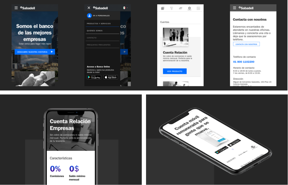
Responsive Pages Adaptations
One of the client’s requirements was for the website to be able to adapt to different devices. The website launch coincided with the app release in Mexico, which demonstrated that Sabadell is not simply a traditional bank, but also one that is able to adapt to market needs. This gave Sabadell a competitive advantage when compared to other banks in Mexico.
SEO Analysis
We did a study of recent Google Analytics data which allowed us to explain to the client what was causing the current website to appear in a lower position and what should be taken into account when programming the new website. We also created a document so that the company creating the content for the website could follow the SEO rules that we had implemented on the website.
Learning and Takeaways
The first step was to understand the current situation of banks in Mexico and how to take a relatively unknown bank in the target country to a new market successfully. In order to do this, we needed a new and innovative website that at the same time showed Banco Sabadell as a serious and well-established entity.


