Stradivarius
Visit Website
Year
2019
Role
Lead UX Designer
Team
Sheila Puig (UX/UI) - Stradivarius
Gianfranco Sebastiani (UX/UI)
Problem Statement
The main aim of this project was to re-design and analyse user behaviour when navigating the main conversion screens, for example: Product list, product page and basket. We also wanted to recognise where the exit points were within the process.
process
The process involved intensive research in order to come up with a competitive analysis. We then had to design the new structure and test each proposal in order to improve some sections of the purchasing process.
Grid and layout
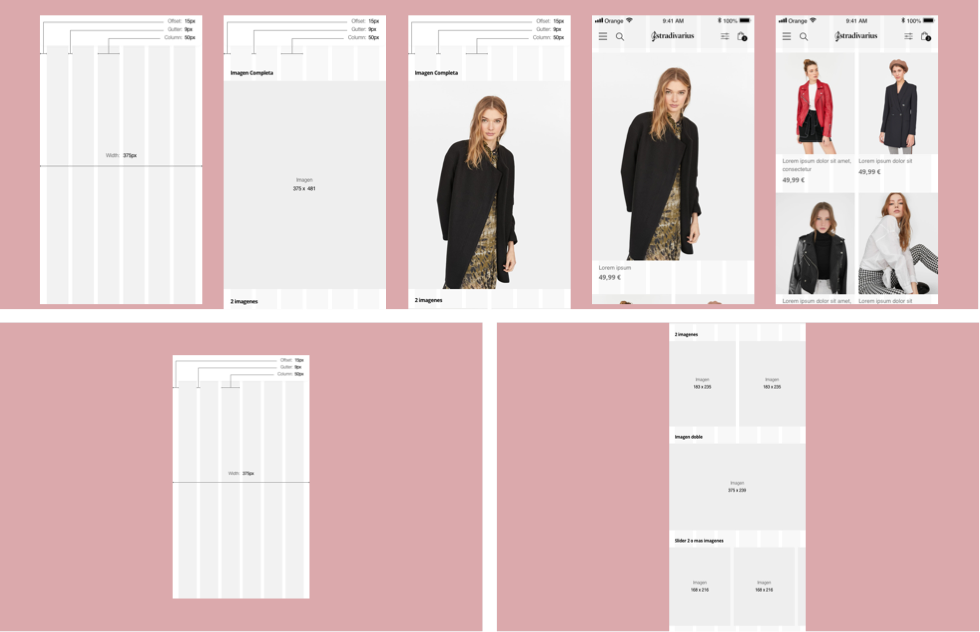
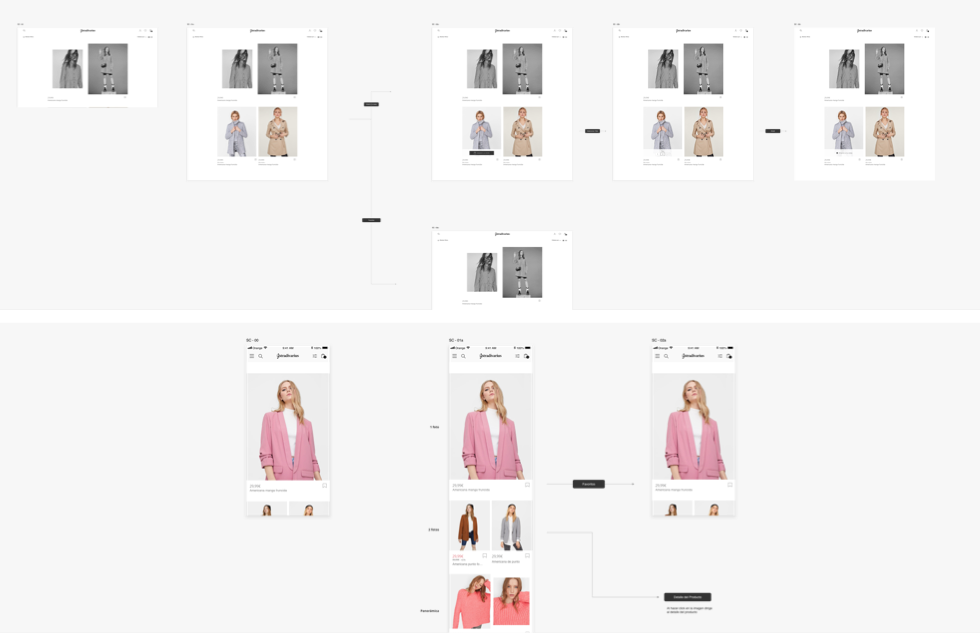
The new design had to be re-adapted to a full-width grid in the mobile version. Many competitors’ websites used full grid images, so we therefore intended to do the same by testing the number of images in each row and whether the sequence that followed should contain a single or a double image when scrolling.
User Flow
One of the challenges was to maintain consistency in the structure whilst offering the same experience and functionalities that the current website had. One of the options we explored was to find a new position for the images and re-design the main logo. In order to do this, we needed to study every possible interaction between the image and the product description so that we could offer the best experience.
User Test
After defining an initial design proposal, we devised the scope of the test and then put together a proposal which covered the key aspects that the client needed us to test, aligning them with the previously defined objectives. We then summarised the key points in a document to present to the client.
Personas
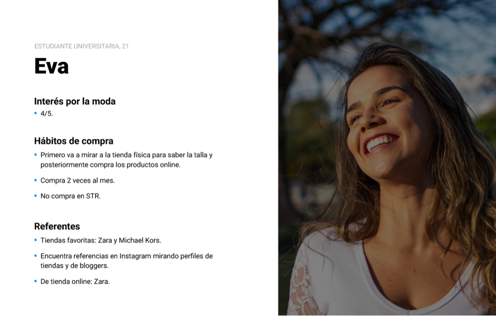
Due to time constraints, we carried out a recruitment process based on searching for relevant profiles within our close circles. The most complex aspect of this was having to find people within the target demographic and coordinate the schedules for interviews.
Prototype and Testing Process
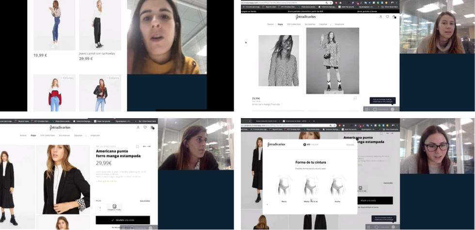
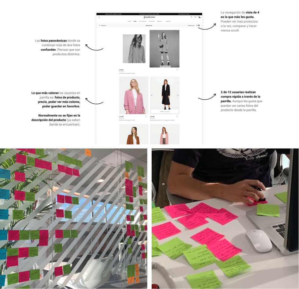
We created a hybrid prototype that allowed us to test both current and new designs, as well as references that the client wanted to validate. After selecting a sample of 12 users related to the profile of the brand's target audience, we invited them for a 45 minute interview where we carried out a series of activities.
Learning and Takeaways
Thanks to the conclusions obtained in the user test, we were able to approach the implementation of the designs with more precise information as to how our clients interacted through the channel. Likewise, we focused decision-making on creating a design centred around the user, and promoted solutions that improved the channel usability.